Text is the backbone of communication in our digital age. Whether you’re writing a blog post, creating content for social media, or just sending an email, the way your text looks can significantly impact how your message is received. But how do you take plain text and make it stylish?Let’s get started with some writing ideas and techniques that will help your work shine.
1. Play with Fonts
Sort of like the clothes your text wears, fonts. The style and tone of your message can be communicated with the correct typeface. If you want your text to appear elegant, consider using fonts like Georgia or Garamond. For a modern, clean look, Helvetica or Arial might be your go-to. Don’t be afraid to mix and match fonts within a document, but be careful not to overdo it using more than two or three different fonts can make your text look chaotic rather than stylish.
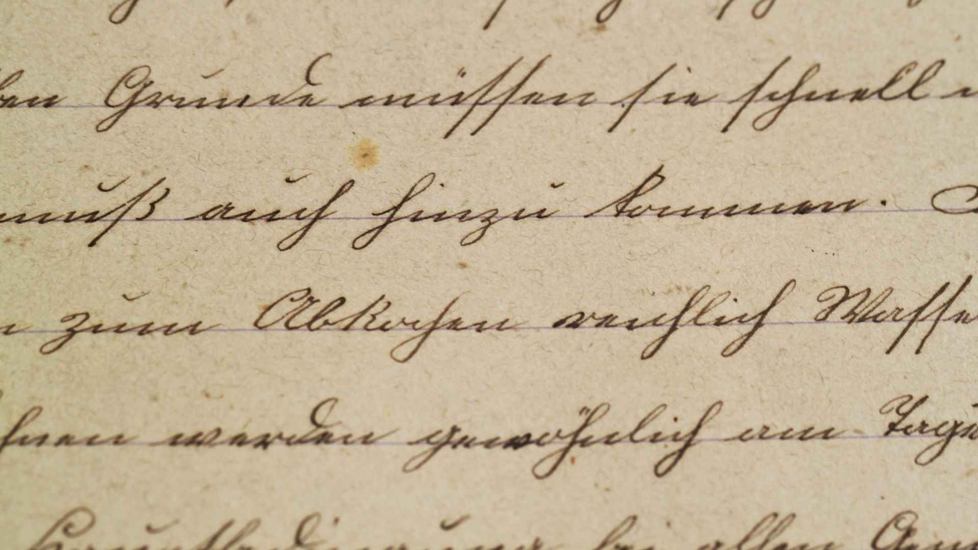
Consider utilizing ornate or script fonts for headings or emphasis while working on a design project or anything else that needs a little extra flair. Fonts like Pacifico or Great Vibes add a touch of flair but should be used sparingly to maintain readability.
2. Incorporate Font Styles
Beyond the font itself, the way you style your text can make a big difference. Using bold, italics, or underlining can emphasize important points and make your text more engaging. For example, *italicizing* a word or phrase can subtly highlight it, while making something **bold** adds emphasis and weight.
Combining styles can also create a layered effect. For instance, **bold italics** draw even more attention to a section of text. Underlining is another tool that, when used appropriately, can add a classic touch, though it’s best reserved for headings or links in digital content.
3. Use Color Wisely
Color is a powerful tool for making text stylish. It can set the mood, draw attention, and create a cohesive theme throughout your document or design. When choosing colors, consider the emotions they evoke—reds and oranges can convey excitement or urgency, while blues and greens tend to be more calming.
But equilibrium is essential. Overuse of color can be overbearing and distracting. Adhering to a color scheme consisting of two or three complementary hues is a wise generalization. For instance, a dark, rich font on a light pastel backdrop might produce a smart and fashionable design. Remember to take contrast into account to make sure your text can be read against the background.
4. Add Text Effects
Text effects can transform ordinary text into something eye-catching. These effects include shadows, outlines, gradients, and textures. For instance, a subtle shadow can give your text a three-dimensional look, making it appear as if it’s popping off the page. Outlines can make text stand out against busy backgrounds, while gradients add depth by blending colors.
When applying text effects, less is often more. Overuse can lead to a cluttered or amateurish appearance, so it’s essential to apply these effects thoughtfully and sparingly.
5. Experiment with Layout and Spacing
The layout of your text affects its readability and aesthetic appeal. Proper use of spacing, alignment, and margins can make your text more inviting and easier to read. For instance, increasing the line spacing (or leading) can make blocks of text feel less cramped, enhancing readability.
Alignment also plays a crucial role. Left-aligned text is the most common and easiest to read, but centered or right-aligned text can be used for stylistic purposes, particularly in headings or quotes. Additionally, white space—or the empty space around your text—can make your content feel more organized and give it a more polished look.
6. Incorporate Icons and Symbols
Icons and symbols are great for breaking up text and adding visual interest. They can serve as bullet points, emphasize key points, or simply add a decorative element. For instance, using a small star icon instead of a traditional bullet point can make your list more engaging.
You can also use symbols like arrows to guide the reader’s eye or hearts to add a playful touch. Just like with colors and effects, it’s important to use icons and symbols in moderation to avoid overwhelming your text.
7. Use Capitalization and Letter Spacing
Sometimes, the way you manipulate the actual letters can add a stylish touch. All caps can make a bold statement, particularly for headings or important phrases. However, using all caps for large blocks of text can be hard to read and may come across as shouting.
Letter spacing, or tracking, can also alter the look of your text. Increasing the spacing between letters can give a more airy, elegant feel while decreasing the spacing can make your text feel more compact and intense. This technique is particularly effective for titles or short, impactful phrases.
8. Introduce Decorative Elements
Incorporating decorative elements like borders, dividers, and frames can add a stylish touch to your text. These elements help to separate different sections of content and can also serve as a visual break for the reader.
For example, using a simple line divider between sections can make your text easier to navigate. Decorative frames around headings or quotes can also add a touch of elegance and sophistication.
9. Combine Text with Images
One of the most powerful ways to make your text stylish is by combining it with images. Text overlays on images can create a strong visual impact, especially when used in social media posts, posters, or banners.
To do this effectively, ensure that your text contrasts well with the image background. You may need to apply a shadow or semi-transparent background to your text to make it stand out. Additionally, be mindful of the image’s composition; placing your text in an area with minimal visual noise will make it more readable.
10. Use Stylish Generators and Tools
If you’re not a design expert, don’t worry—plenty of tools can help you create stylish text with ease. Online generators can instantly transform your text into something unique and eye-catching. For example, text generator tools offer a variety of font styles, including script, cursive, and bold italic, that you can apply with just a few clicks.
You can also find tools that let you add effects like glitching, rainbow colors, or 3D text. These generators are perfect for creating titles, social media posts, or any content where you want to add a bit of flair without spending too much time on design.
Conclusion
Making your text stylish is about more than just picking a fancy font. It’s about creating a cohesive look that enhances your message and makes your content more engaging. By playing with fonts, colors, effects, and layouts, you can transform plain text into something that’s not just read but remembered. Whether you’re writing a blog post, designing a website, or crafting a social media update, these tips will help you make your text stand out and leave a lasting impression. So, go ahead—experiment, play, and most importantly, have fun with your text!


